Integrated Executive Summary reporting
NAVIGATION Strategy > (select an organization) > (select a starting year) > Add Meeting > Next > Add Reports
NAVIGATION QBR Report Builder > (add or edit a report) > Add > Executive Summary
myITprocess includes the Integrated Executive Summary, a powerful feature designed to simplify the reporting process for MSPs. Mapping myITprocess organizations to organizations or sites in your other Kaseya modules allows you to surface data from those modules in myITprocess Executive Summary reports.
This tool streamlines data gathering, allows for personalized report customization, and ensures that all reports maintain a consistent, professional look.
Prerequisites
KaseyaOne Unified Login
Enable Log In with KaseyaOne must be turned on in the myITprocess account and for all modules you would like to generate Executive Summary reports for. Refer to Enabling Log In with KaseyaOne in this Help system and the per-module instructions in the KaseyaOne Help system.
Organization/site mapping
Determine which Kaseya modules and which organizations or sites you want to be able to see Executive Summary report data for. Only modules with Enable Log In with KaseyaOne turned on are available for mapping on the Setup Organizations page in myITprocess. To generate an Executive Summary report for an organization or site in a certain Kaseya module, it must be mapped to its matching myITprocess organization on the Setup Organizations page.
For details, refer to Performing organization mapping.
Generating Executive Summary reports
You can generate an Executive Summary report through a Strategic Roadmap meeting or the QBR Report Builder.
Once added to a meeting agenda or QBR report, Executive Summary data appears in the corresponding meeting presentation or exported QBR report as configured.
 Add an Executive Summary report to a Strategic Roadmap meeting agenda
To create a meeting for an organization to which you can add one or more Executive Summary reports, follow the steps in the Add a meeting section in Adding and managing meetings.
In Create Meeting - Step 2 of the meeting creation workflow pane, complete the following steps to add an Executive Summary report to the meeting agenda:
- Click Add Reports.
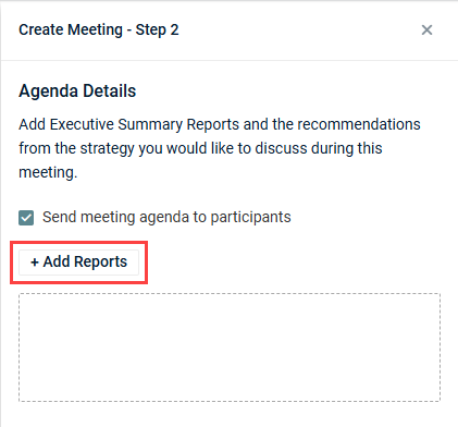
NOTE If the Add Reports option is missing, refer to Prerequisites to ensure the organization selected on the Strategic Roadmap is adequately configured for Executive Summary report generation.
- From the Module drop-down menu, select the module you want to generate report data for.
- The Site field is displayed for modules with synced site data. Select a site from the drop-down menu, if required.
- In the Date Range field, manually select a start date and an end date from the calendar date selector, or select one of the following options to automatically populate the start and end date:
- This week
- Last week
- Last 30 days
- Last 90 days
The data shown in the report will reflect the selected time period.
- Select or clear checkboxes to add or remove certain widgets from the report, respectively. This allows you to control what types of data and metrics you present to the client. Your configuration is reflected in the preview.
NOTE Only modules that have Enable Log In with KaseyaOne turned on and are mapped to myITprocess organizations are available. Refer to Performing organization mapping.
- Click Add to add the Executive Summary report to the meeting agenda.
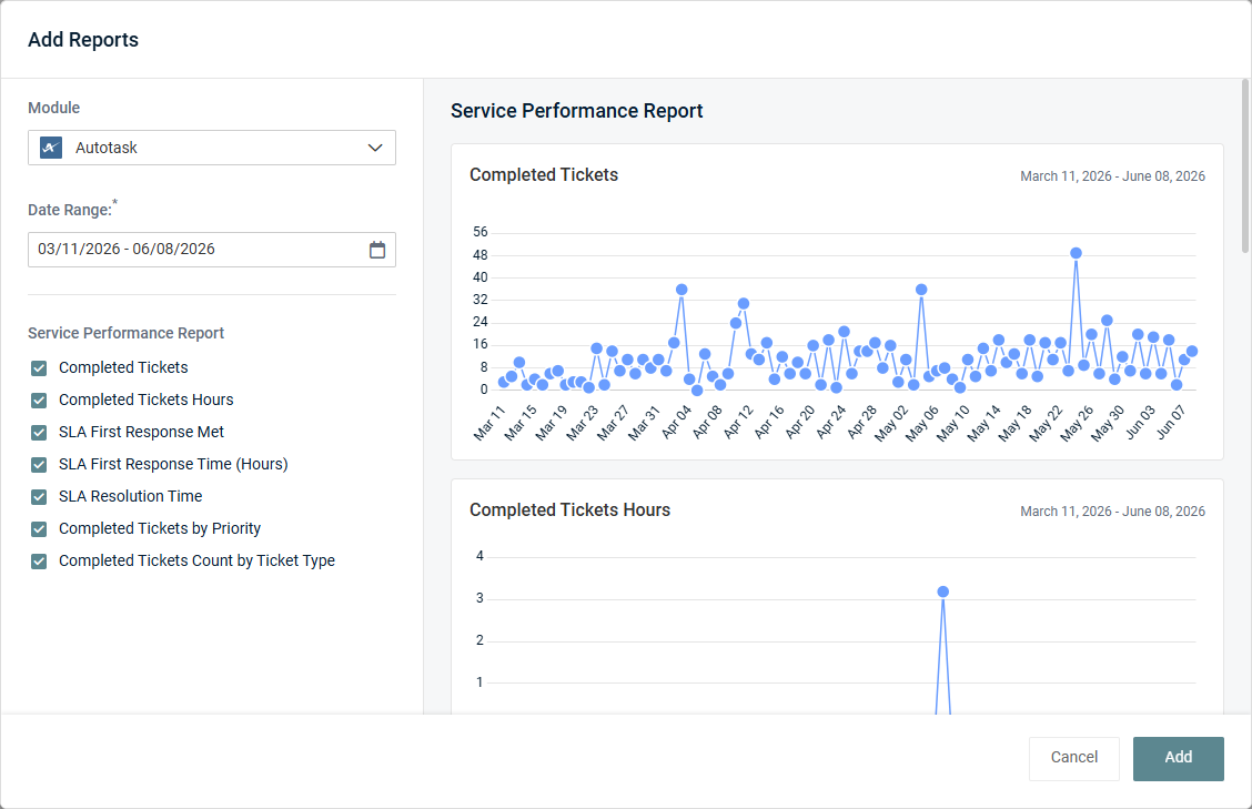
Click Add Reports as many times as necessary to attach any number of Executive Summary reports to the meeting.
To edit report settings post-addition, hover over the report card in the meeting agenda and click the edit icon  . To delete the report, click the X icon. The report is automatically named based on the selected module. For a list of all report names according to the modules, refer to Executive Summary report data.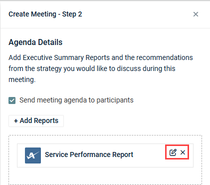
When one or more items have been added to the meeting agenda (Executive Summary reports, recommendations, and/or contracts), meeting creation is enabled. Clicking Create creates the meeting with the configured agenda.
Add an Executive Summary section to a QBR report
To create a QBR report for an organization to which you can add one or more Executive Summary sections, follow the steps in the Create a QBR report section in Using the QBR Report Builder.
TIP You have the option to configure and include Executive Summary sections in QBR report templates for reuse across multiple QBR reports. Refer to Create a QBR report template in Using the QBR Report Builder.
Once the QBR report is created and you are configuring it in the QBR Report Builder, complete the following steps to include an Executive Summary section in the report:
- In the Table of Contents pane on the left side of the page, click Add.
- Select Executive Summary.
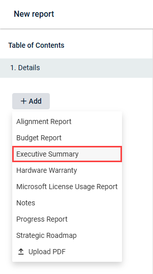
NOTE If the Executive Summary option is missing, refer to Prerequisites to ensure the organization selected for the report is adequately configured for Executive Summary report generation.
- From the Module drop-down menu, select the module you want to generate report data for.
- The Site field is displayed for modules with synced site data. Select a site from the drop-down menu, if required.
- In the Date Range field, manually select a start date and an end date from the calendar date selector, or select one of the following options to automatically populate the start and end date:
- This week
- Last week
- Last 30 days
- Last 90 days
The data shown in the report will reflect the selected time period.
- Select or clear checkboxes to add or remove certain widgets from the report, respectively. This allows you to control what types of data and metrics you present to the client. Your configuration is reflected in the preview.
NOTE Only modules that have Enable Log In with KaseyaOne turned on and are mapped to myITprocess organizations are available. Refer to Performing organization mapping.
The section is automatically saved as configured.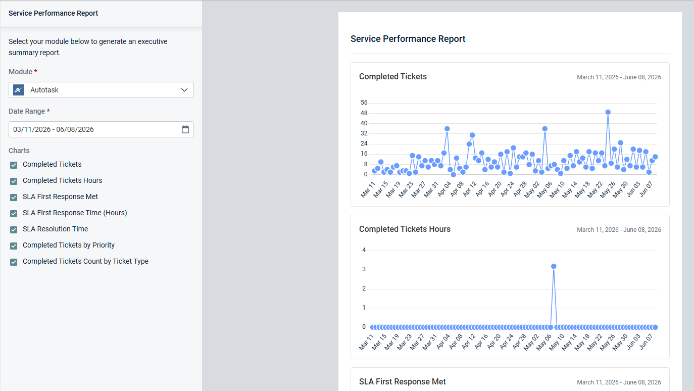
You can add any number of Executive Summary sections to the report along with other sections/data types (such as Alignment Report, Budget Report, and so forth).
The section is automatically named based on the selected module. For a list of all report names according to the modules, refer to Executive Summary report data.
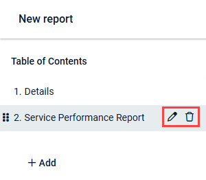
To change any of the default section names to custom names, hover over a section in the Table of Contents pane and click the pencil icon  . In exported reports, the section names appear in the Table of Contents and as page titles at the start of each section.
To delete a section, hover over it and click the trash can icon  . In the confirmation pop-up window, click Delete.
To complete the report, refer to Save and export a QBR report in Using the QBR Report Builder.
Executive Summary report data
This section summarizes the data included in Executive Summary reports for all currently supported modules, organized by category.
Module data is available only for mapped organizations. The list of modules in the Module drop-down menu for the selected organization is based on the organization mapping on the Setup Organizations page. Refer to Performing organization mapping.
Service Delivery
Autotask: Service Performance Report
The Autotask Executive Summary report provides insight into the selected organization's service desk performance and operational efficiency during the selected date range. This data helps organizations evaluate service quality, identify improvement opportunities, and track support performance over time.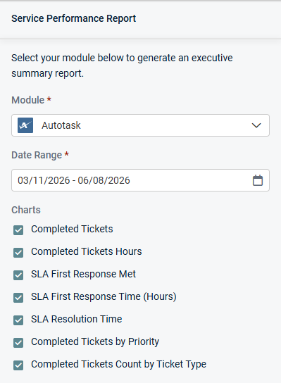
Charts
Select or clear checkboxes to add or remove the following widgets from the report, respectively:
-
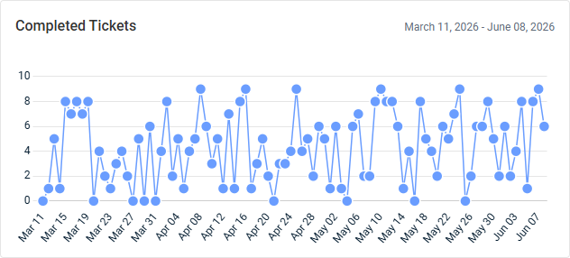
Completed Tickets: This line graph displays the number of tickets completed per day. Hover over the points on the graph to see tooltips for all dates and ticket counts.
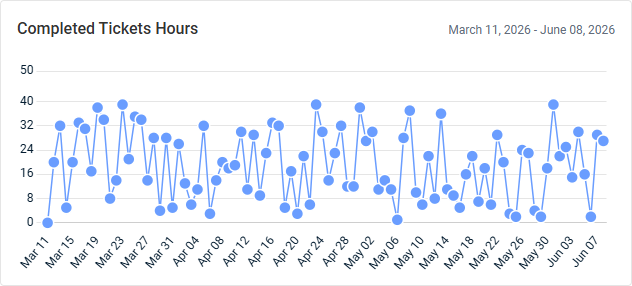
- Completed Tickets Hours: This line graph displays the sum of hours worked (billable and non-billable) for tickets completed per day. Hover over the points on the graph to see tooltips for all dates and hour counts.
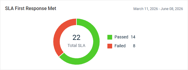
- SLA First Response Met: This donut chart displays the total number of completed tickets with a Service Level Agreement (SLA) that has First Response tracking configured. SLA first response compliance is determined by comparing the SLA first response due date and time to the date and time when the ticket status change satisfies the SLA requirement. This chart is grouped as follows:
- Passed: The number of tickets that met the SLA first response requirement before the due date and time.
- Failed: The number of tickets that did not meet the SLA first response requirement before the due date and time.
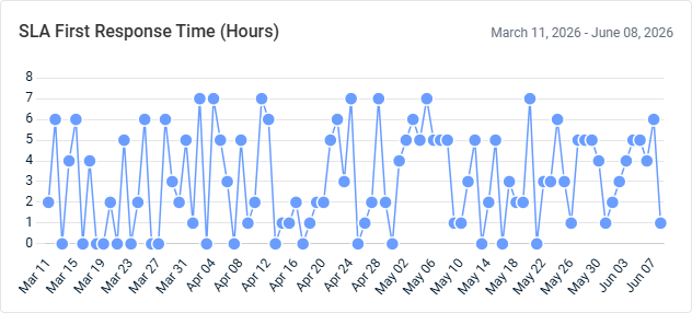
- SLA First Response Time (Hours): This line graph displays the average SLA first response time, in hours, for completed tickets per day. SLA first response time is calculated as the elapsed time between ticket creation and the ticket status change that satisfies the SLA first response requirement. Time calculations respect the SLA timeframe configuration, including business hours, extended hours, or 24/7 coverage. Hover over the points on the graph to see tooltips for all dates and hour counts.
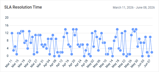
- SLA Resolution Time: This line graph displays the average SLA resolution time, in hours, for completed tickets per day. SLA resolution time is calculated as the elapsed time between ticket creation and the ticket status change that satisfies the SLA resolution requirement. Time calculations respect the SLA timeframe configuration, including business hours, extended hours, or 24/7 coverage. Hover over the points on the graph to see tooltips for all dates and hour counts.
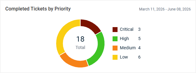
- Completed Tickets By Priority: This donut chart displays the total number of completed tickets, grouped by priority.
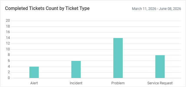
- Completed Tickets Count by Ticket Type: This bar chart shows the number of completed tickets by ticket type. Hover over the bars to see tooltips for all ticket types and counts.
NOTE If a ticket is completed, re-opened, and closed again on the same day, then this ticket-closing event is counted only once. However, if the ticket is re-opened and completed on a different day, it is re-aggregated in that day’s count.
BMS: Service Performance Report
The BMS Executive Summary report provides insight into the selected organization's service desk performance and operational efficiency during the selected date range. This data helps organizations evaluate service quality, identify improvement opportunities, and track support performance over time.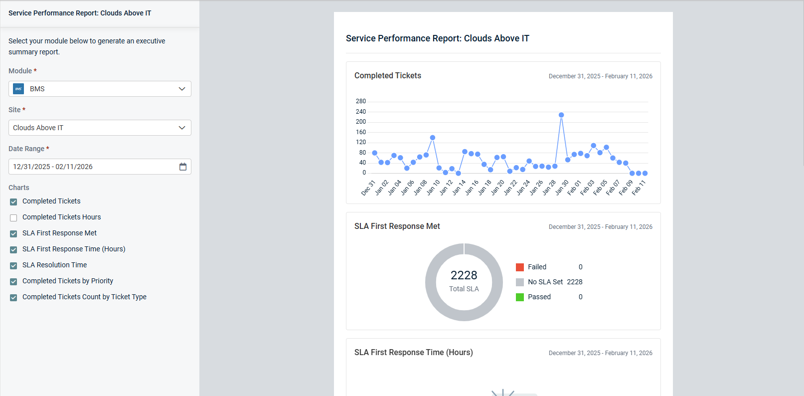
Charts
Select or clear checkboxes to add or remove the following widgets from the report, respectively:
-
Completed Tickets: This line graph displays the number of tickets completed per day. Hover over the points on the graph to see tooltips for all dates and ticket counts.
- Completed Tickets Hours: This line graph displays the sum of hours worked (billable and non-billable) for tickets completed per day. Hover over the points on the graph to see tooltips for all dates and hour counts.
- SLA First Response Met: This donut chart displays the total number of completed tickets with a Service Level Agreement (SLA) that has First Response tracking configured. SLA first response compliance is determined by comparing the SLA first response due date and time to the date and time when the ticket status change satisfies the SLA requirement. This chart is grouped as follows:
- Passed: The number of tickets that met the SLA first response requirement before the due date and time.
- Failed: The number of tickets that did not meet the SLA first response requirement before the due date and time.
- SLA First Response Time (Hours): This line graph displays the average SLA first response time, in hours, for completed tickets per day. SLA first response time is calculated as the elapsed time between ticket creation and the ticket status change that satisfies the SLA first response requirement. Hover over the points on the graph to see tooltips for all dates and hour counts.
- SLA Resolution Time: This line graph displays the average SLA resolution time, in hours, for completed tickets per day. SLA resolution time is calculated as the elapsed time between ticket creation and the ticket status change that satisfies the SLA resolution requirement. Hover over the points on the graph to see tooltips for all dates and hour counts.
- Completed Tickets By Priority: This donut chart displays the total number of completed tickets, grouped by priority.
- Completed Tickets Count by Ticket Type: This bar chart shows the number of completed tickets by ticket type. Hover over the bars to see tooltips for all ticket types and counts.
NOTE If a ticket is completed, re-opened, and closed again on the same day, then this ticket-closing event is counted only once. However, if the ticket is re-opened and completed on a different day, it is re-aggregated in that day’s count.
Datto RMM: Endpoint Monitoring and Management Report
The Datto RMM Executive Summary report provides visibility into the selected organization's network health, security, and maintenance during the selected date range. This data helps organizations identify risks, improve device compliance, and maintain a stable and secure IT environment.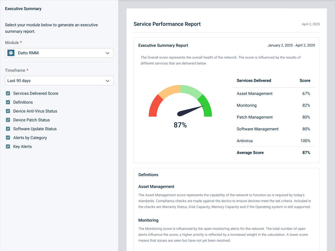
NOTE The Setup Organizations page allows you to map multiple Datto RMM sites to a single myITprocess organization. Refer to Mapping multiple Datto RMM sites in Performing organization mapping. When generating a Datto RMM Executive Summary report, if the selected organization has multiple sites mapped, use the Sites drop-down menu to select a specific site.
Charts
Select or clear checkboxes to add or remove the following widgets from the report, respectively:
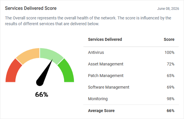
- Services Delivered Score: This widget displays individual scores for various Datto RMM delivered service categories as well as the average score reflecting the overall health of the network.
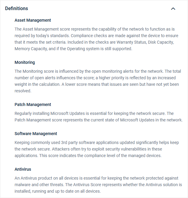
- Definitions: This widget displays descriptions of how the scores for the various delivered service categories are calculated.
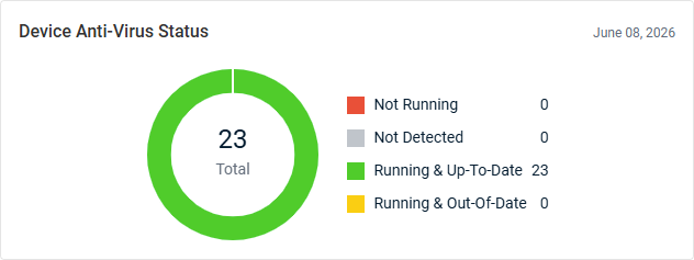
- Device Anti-Virus Status: This donut chart displays the total number of devices with an antivirus status, grouped by status. This breakdown allows for quick identification of the number of devices that may be vulnerable due to missing, outdated, or inactive antivirus protection.
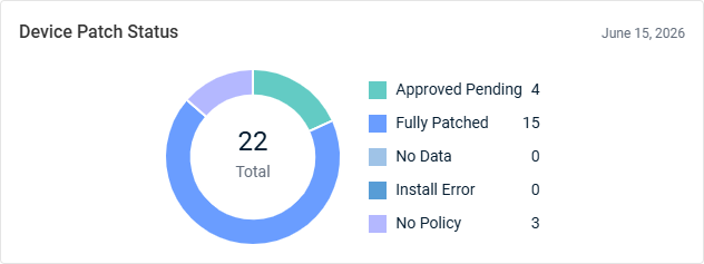
- Device Patch Status: This donut chart displays the total number of devices with a patch status, grouped by status. This breakdown provides visibility into patch compliance.
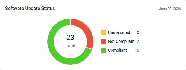
- Software Update Status: This donut chart displays the total number of managed assets with a software update compliance status, grouped by status. This breakdown provides visibility into any gaps in software update coverage.
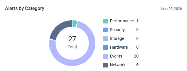
- Alerts by Category: This donut chart displays the total number of alerts, grouped by alert category. Alerts created within the last 24 hours as well as currently open alerts are reflected, enabling trend identification and prioritization of remediation efforts based on the most common issues affecting the environment.
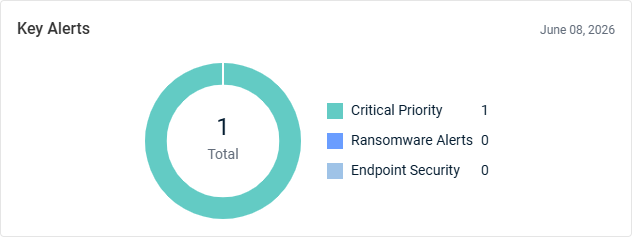
- Key Alerts: This donut chart displays the total number of key alerts, including those raised with a priority of Critical, from detected ransomware, and from an Endpoint Security configuration in Datto RMM. By surfacing high-impact issues, this widget helps IT teams identify and respond to threats, security concerns, and operational incidents.
Security
Datto Anti Virus: Anti Virus Report
The Datto AV Executive Summary report provides insight into the selected organization's antivirus coverage and threat activity during the selected date range. This data helps organizations evaluate endpoint protection effectiveness and identify emerging security risks.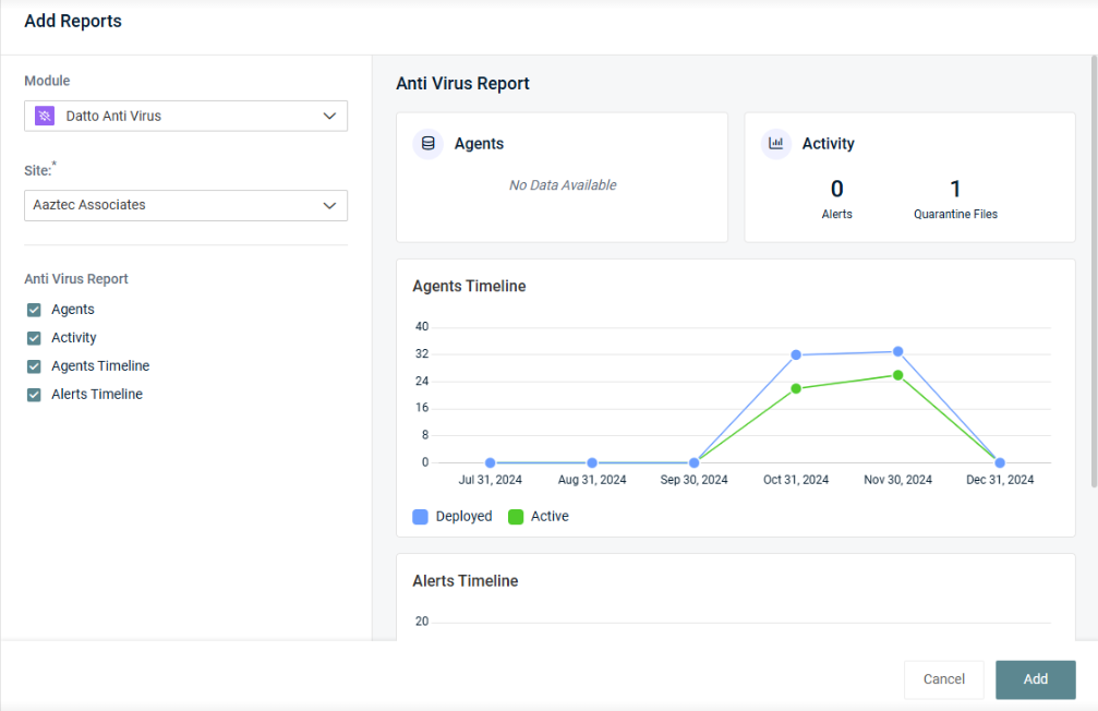
Charts
Select or clear checkboxes to add or remove the following widgets from the report, respectively:
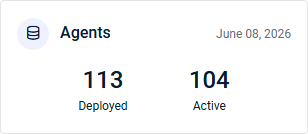
- Agents: This widget summarizes Datto AV agent activity, including the number of deployed and active agents.
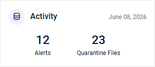
- Activity: This widget summarizes Datto AV security-related activity, including the number of alerts and files placed in quarantine (files that have been isolated for future analysis, decontamination, or deletion).
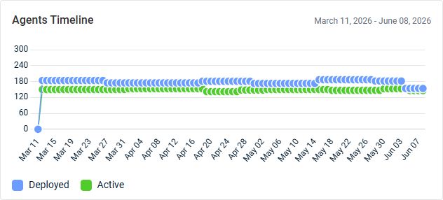
- Agents Timeline: This line graph displays the number of Datto AV agents used per day. Deployed and active agents are tracked separately for comparison, identifying trends in service health. Hover over the points on the graph to see tooltips for all dates and agent counts.
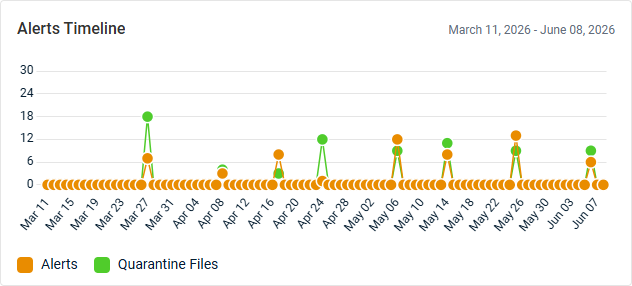
- Alerts Timeline: This line graph displays the number of Datto AV alerts and quarantined files per day, tracked separately for comparison. Hover over the points on the graph to see tooltips for all dates and counts.
Datto EDR: Endpoint Detection and Response Report
The Datto EDR Executive Summary report provides visibility into the selected organization's endpoint security posture and threat response activity during the selected date range. This data helps organizations assess protection effectiveness and respond to emerging threats.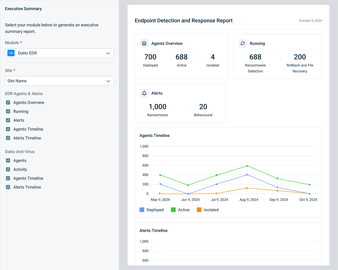
Charts
Select or clear checkboxes to add or remove the following widgets from the report, respectively:
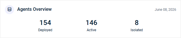
- Agents Overview: This widget summarizes Datto EDR agent activity, including the number of deployed, active, and isolated agents.
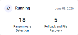
- Running: This widget displays the number of endpoints protected by Datto EDR's ransomware response features: Ransomware Detection and Rollback and File Recovery. Ransomware Detection identifies and responds to ransomware activity through behavioral analysis, while Rollback and File Recovery enables rapid restoration of files impacted by ransomware. These metrics aid in detecting threats, containing attacks, and recovering affected data.
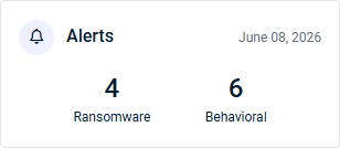
- Alerts: This widget displays the number of Datto EDR ransomware and behavioral alerts, providing a quick view of active threat activity and suspicious behavior across monitored endpoints.
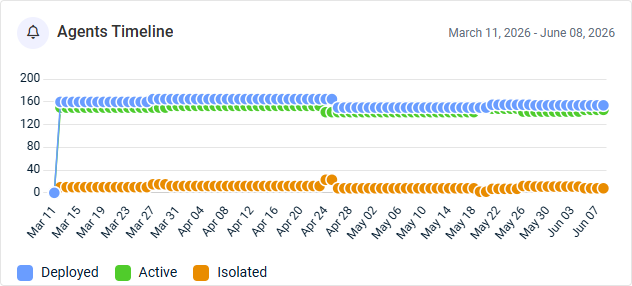
- Agents Timeline: This line graph displays the number of Datto EDR agents used per day. Deployed, active, and isolated agents are tracked separately for comparison, identifying trends in service health. Hover over the points on the graph to see tooltips for all dates and agent counts.
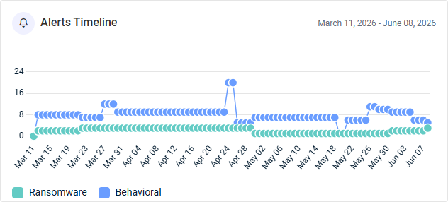
- Alerts Timeline: This line graph displays the number of Datto EDR ransomware and behavioral alerts per day, tracked separately for comparison. Hover over the points on the graph to see tooltips for all dates and alert counts.
Graphus: Email Security Report
The Graphus Executive Summary report provides insight into the selected organization's email threat protection effectiveness during the selected date range. This data helps organizations understand their exposure to email-based threats and the value of their email security controls.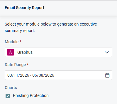
Charts
Keep the following checkbox selected to generate data in the report, which is displayed in a single widget:
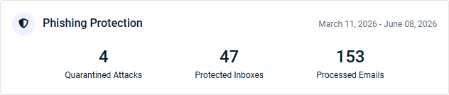
- Phishing Protection: This widget summarizes Graphus phishing protection:
- Quarantined Attacks: The number of phishing emails quarantined by Graphus or the Graphus admin.
- Protected Inboxes: The number of email inboxes protected by Graphus.
- Processed Emails: The number of emails from protected inboxes that Graphus analyzed.
Inky: Email Security Report
The INKY Executive Summary report provides visibility into the selected organization's email threat activity and user productivity during the selected date range. This data helps organizations measure both security effectiveness and operational efficiency.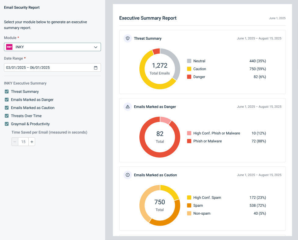
Charts
Select or clear checkboxes to add or remove the following widgets from the report, respectively:
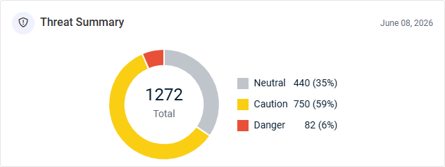
- Threat Summary: This donut chart displays the total number of emails processed by INKY, grouped by classification.
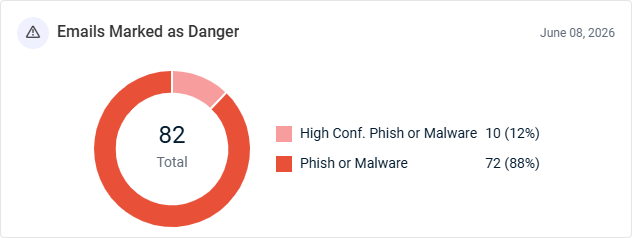
- Emails Marked as Danger: This donut chart displays the total number of emails INKY flagged as Danger, grouped by high-confidence and regular phishing and malware.
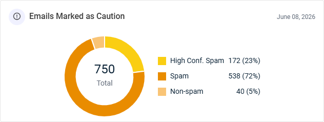
- Emails Marked as Caution: This donut chart displays the total number of emails INKY flagged as Caution, grouped by high-confidence spam, spam, and non-spam.
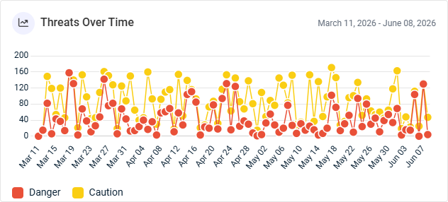
- Threats Over Time: This line graph displays the number of emails INKY flagged as Danger and Caution per day, tracked separately for comparison. This view allows for identification of spikes in malicious activity, trend tracking, and correlation of threat surges with specific events or time periods. Hover over the points on the graph to see tooltips for all dates and email counts.
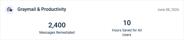
- Graymail & Productivity: This widget summarizes results from INKY's graymail protection feature (automatic identification of bulk newsletters and promotional mail that isn't dangerous but clutters an inbox):
- Messages Remediated: The number of emails automatically detected and handled based on configured inbox rules.
- Hours Saved for All Users: The estimated number of hours saved across all users, calculated by multiplying the remediated message count by the per-email time savings value set in the Time Saved per Email field (defaulting to 15 seconds).
Network Detective Pro: Network Security Report
The Network Detective Pro Executive Summary report provides a high-level view of the selected organization's security posture in the last 30 days. This data shows the number of risk findings from scans and assessments across key technology areas as well as potential sources of data breaches and associated liability.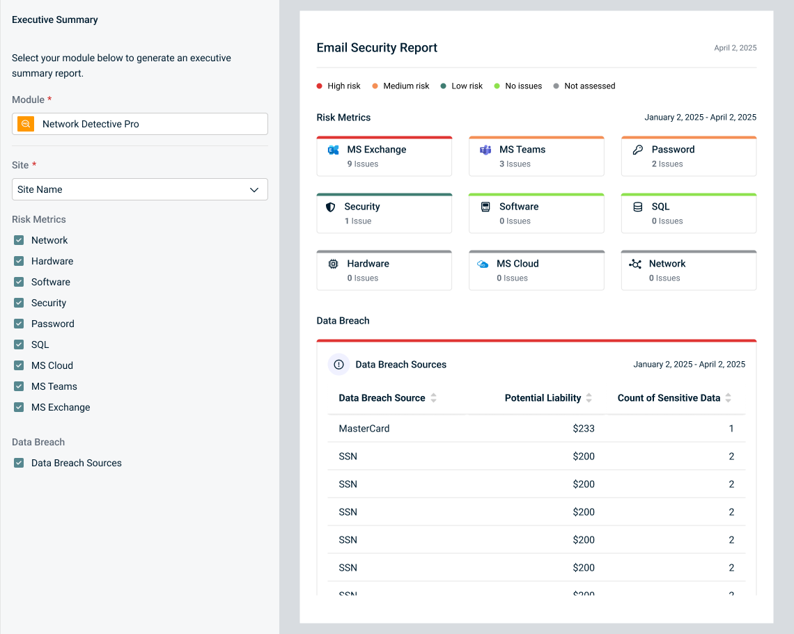
Charts
Select or clear checkboxes to add or remove the following widgets from the report, respectively:
Risk Metrics
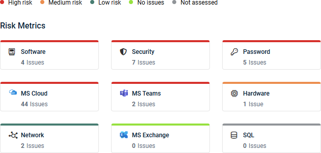
These widgets are color-coded based on risk level, according to the key at the top of the report data. The number of issues in each of the following categories identified through Network Detective Pro assessments are displayed:
- Network: Potential vulnerabilities in network infrastructure.
- Hardware: Potential vulnerabilities in hardware components.
- Software: Potential vulnerabilities in software applications.
- Security: Potential vulnerabilities in security protocols.
- Password: Potential vulnerabilities in password policies.
- SQL: Potential vulnerabilities in SQL databases.
- MS Cloud: Potential vulnerabilities in the Microsoft Cloud environment.
- MS Teams: Potential vulnerabilities in the Microsoft Teams environment.
- MS Exchange: Potential vulnerabilities in the Microsoft Exchange environment.
Data Breach
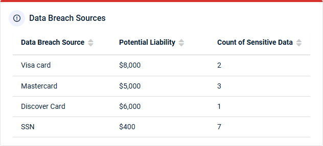
- Data Breach Sources: This table summarizes data breach exposure identified through security assessments in Network Detective Pro. A data breach is an incident in which an individual's personally identifiable information (PII), including medical, financial, payment card, or other sensitive data, may have been exposed, lost, or accessed by unauthorized parties in electronic form.
- Data Breach Source: The system, repository, or location where sensitive data is stored or exposed.
- Potential Liability: The estimated financial impact if the sensitive data was compromised. Liability estimates are based on industry-recognized breach cost research and are intended to help quantify organizational risk.
- Count of Sensitive Data: The number of sensitive records or instances identified that could be targeted by unauthorized users, hackers, or malicious insiders.
Backup
Datto Backup for Microsoft Azure: Microsoft Azure Backup Report
The Datto Backup for Microsoft Azure Executive Summary report provides visibility into the selected organization's backup reliability and data protection readiness during the selected date range. This data helps organizations identify backup issues, monitor coverage, and ensure critical data can be recovered when needed.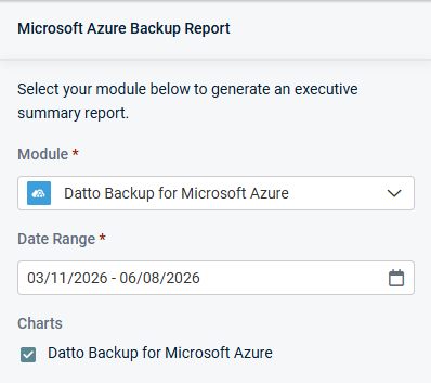
Charts
Keep the following checkbox selected to generate data in the report, which is displayed in a single widget:
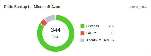
- Datto Backup for Microsoft Azure: This donut chart displays the total number of backups, grouped by successful backups, failed backups, and paused agents.
Datto BCDR: Storage Utilization
The Datto BCDR Executive Summary report provides visibility into the selected organization's backup system health and storage capacity during the selected date range. This data helps organizations maintain backup reliability and proactively manage storage.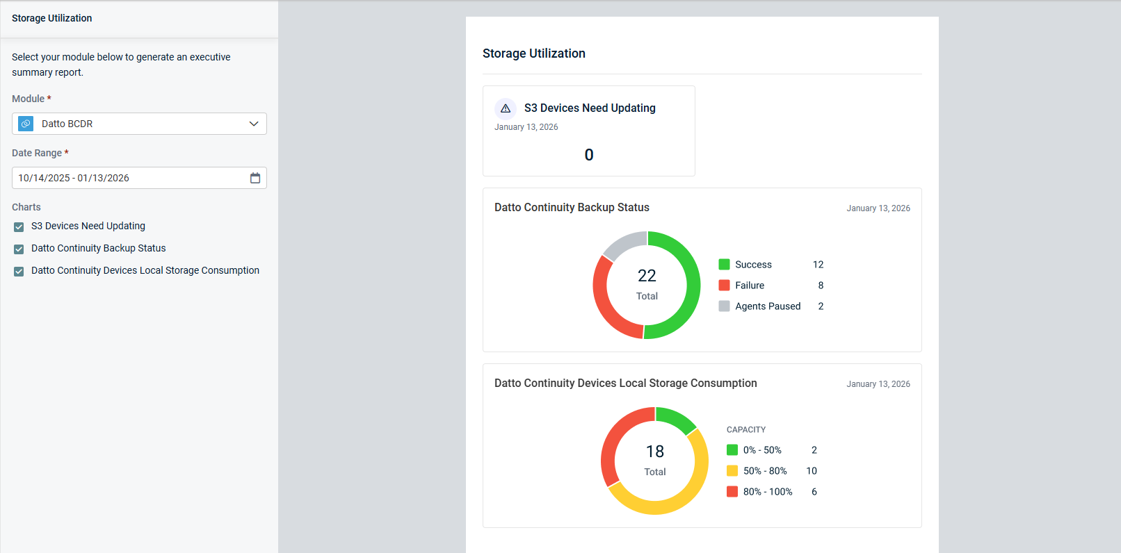
Charts
Select or clear checkboxes to add or remove the following widgets from the report, respectively:
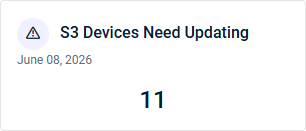
- S3 Devices Need Updating: This widget displays the number of S3 devices requiring updates, ensuring optimal performance and security.
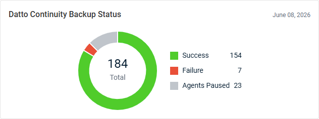
- Datto Continuity Backup Status: This donut chart displays the total number of backups, grouped by successful backups, failed backups, and paused agents.
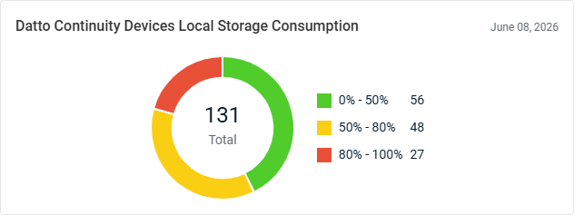
- Datto Continuity Devices Local Storage Consumption: This donut chart displays the total number of devices, grouped by storage consumption percentage ranges.
Datto Endpoint Backup for PCs: PC Backup Report
The Datto Endpoint Backup for PCs Executive Summary report provides visibility into the selected organization's PC endpoint backup health during the selected date range. This data helps organizations ensure critical user data is protected and recoverable.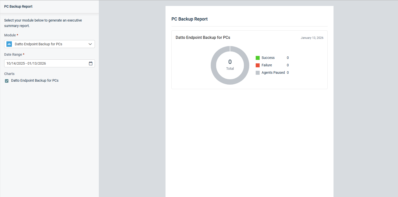
Charts
Keep the following checkbox selected to generate data in the report, which is displayed in a single widget:
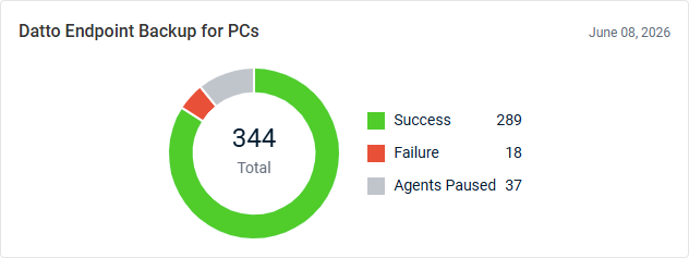
- Datto Endpoint Backup for PCs: This donut chart displays the total number of backups, grouped by successful backups, failed backups, and paused agents.
Datto Endpoint Backup for Servers: Servers Backup Report
The Datto Endpoint Backup for Servers Executive Summary report provides insight into the selected organization's backup reliability and business continuity readiness during the selected date range. This data helps organizations identify backup issues, maintain protection for critical systems, and ensure recovery capabilities remain intact.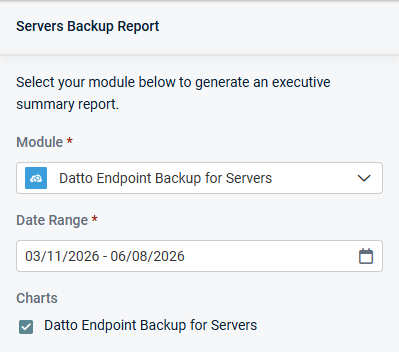
Charts
Keep the following checkbox selected to generate data in the report, which is displayed in a single widget:
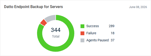
- Datto Endpoint Backup for Servers: This donut chart displays the total number of backups, grouped by successful backups, failed backups, and paused agents.
Datto File Protection: File Protection Report
The Datto File Protection Executive Summary report provides visibility into the selected organization's backup coverage, storage utilization, and device health across workstations and servers during the selected date range. This data helps organizations ensure critical data is protected, recoverable, and properly maintained.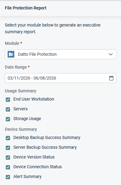
Charts
Select or clear checkboxes to add or remove the following widgets from the report, respectively:
Usage Summary
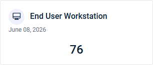
- End User Workstation: This widget displays the combined total number of used Datto File Protection desktop and laptop device licenses.
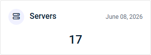
- Servers: This widget displays the number of used Datto File Protection server licenses.
- Storage Usage: This widget displays the amount of storage currently used by Datto File Protection backups. For unlimited storage plans, the total storage consumed is shown in gigabytes (GB). For metered storage plans, storage usage is displayed relative to the total storage allocation, allowing for monitoring of capacity consumption.

Device Summary
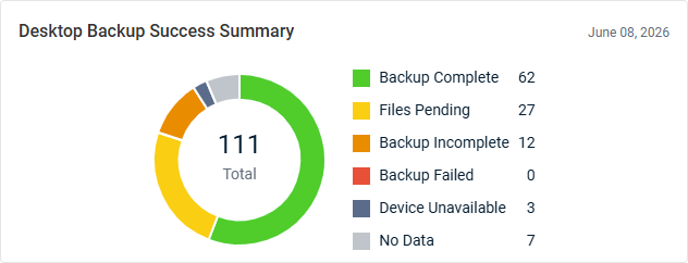
- Desktop Backup Success Summary: This donut chart displays the total number of desktop and laptop devices, grouped by backup outcomes. This breakdown provides visibility into backup health and areas requiring attention.
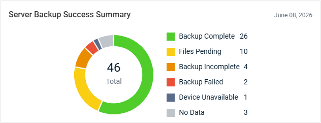
- Server Backup Success Summary: This donut chart displays the total number of servers, grouped by backup outcomes. This breakdown provides visibility into backup health and areas requiring attention.
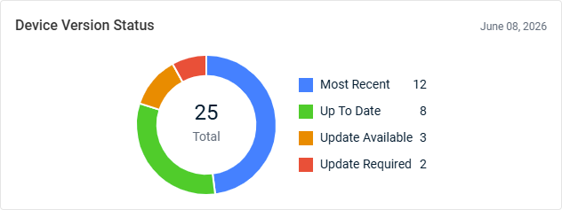
- Device Version Status: This donut chart displays the total number of devices with a device software version status, grouped by status. This breakdown brings attention to the number of devices that may require updates.
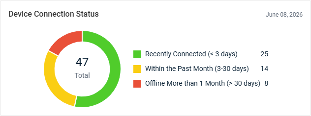
- Device Connection Status: This donut chart displays the total number of devices with a connection status, grouped by connection recency. This breakdown brings attention to the number of devices that are offline or may require attention.
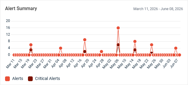
- Alert Summary: This line graph displays the number of alerts generated per day. Alerts and critical alerts are tracked separately for comparison, allowing for monitoring of operational issues and identification of trends in service health. Hover over the points on the graph to see tooltips for all dates and alert counts.
Datto SaaS Protection: SaaS Backup Status Report
The Datto SaaS Protection Executive Summary report provides visibility into the selected organization's cloud data protection and backup readiness during the selected date range. This data helps organizations ensure critical cloud data remains protected, recoverable, and compliant with business continuity requirements.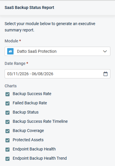
Charts
Select or clear checkboxes to add or remove the following widgets from the report, respectively:
- Backup Success Rate: This widget displays the percentage of backup attempts that completed successfully. This metric provides a measure of backup reliability and helps assess how consistently data is being protected.
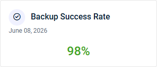
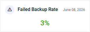
- Failed Backup Rate: This widget displays the percentage of backup attempts that failed. Monitoring this metric helps identify potential issues that may impact data protection and backup reliability.
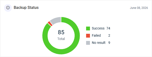
- Backup Status: This donut chart displays the total number of backup jobs, grouped by backup status. This breakdown brings attention to gaps in backup operations and the number of jobs that may require attention.
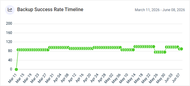
- Backup Success Rate Timeline: This line graph displays the percentage of services that were successfully backed up per day, highlighting backup performance trends and periods of reduced reliability or improvement. Hover over the points on the graph to see tooltips for all dates and percentages.
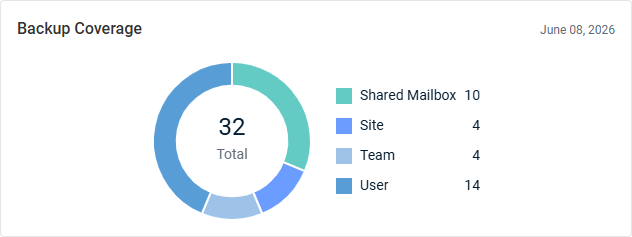
- Backup Coverage: This donut chart displays the total number of protected assets, grouped by asset type.
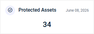
- Protected Assets: This widget displays the number of unique assets that have an active backup policy or backup job and have completed at least one successful backup.
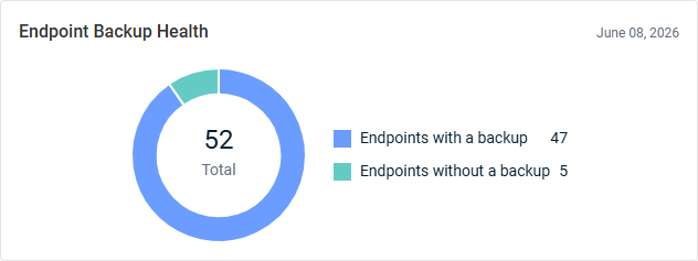
- Endpoint Backup Health: This donut chart displays the total number of endpoints, grouped by endpoints with a backup (protected) and without a backup (unprotected). An endpoint is considered protected when it has completed at least one backup within the previous 30 days.
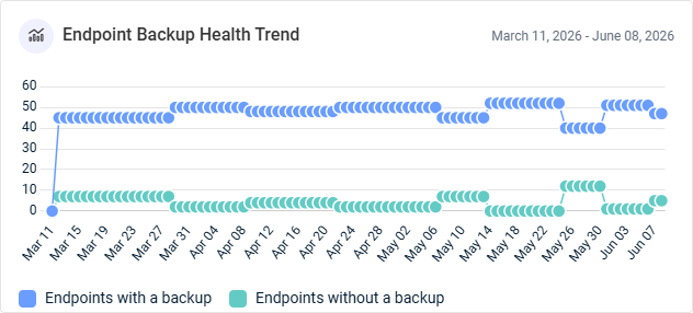
- Endpoint Backup Health Trend: This line graph displays the number of endpoints with and without backups per day. Monitoring endpoint protection can help identify improvements in backup adoption and overall data protection coverage.
Datto Workplace: Workplace Report
The Datto Workplace Executive Summary report provides visibility into the selected organization's file protection, storage utilization, device health, and sensitive data exposure during the selected date range. This data helps organizations manage risk, maintain operational readiness, and safeguard critical business data.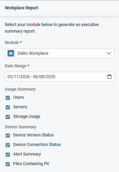
Charts
Select or clear checkboxes to add or remove the following widgets from the report, respectively:
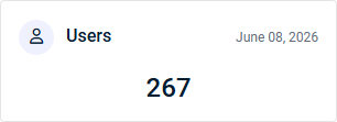
- Users: This widget displays the number of used Datto Workplace user licenses.
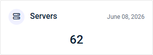
- Servers: This widget displays the number of used Datto Workplace server licenses.
- Storage Usage: This widget displays the amount of storage currently used by Datto Workplace backups. For unlimited storage plans, the total storage consumed is shown in gigabytes (GB). For metered storage plans, storage usage is displayed relative to the total storage allocation, allowing you to monitor capacity consumption.

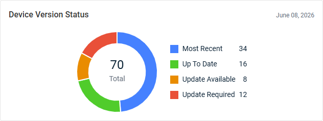
- Device Version Status: This donut chart displays the total number of devices with a device software version status, grouped by status. This breakdown brings attention to the number of devices that may require updates.
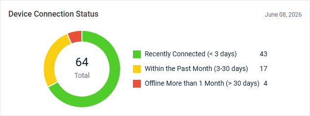
- Device Connection Status: This donut chart displays the total number of devices with a connection status, grouped by connection recency. This breakdown brings attention to the number of devices that are offline or may require attention.
- Alert Summary: This line graph displays the number of alerts generated per day. Alerts and critical alerts are tracked separately for comparison, allowing for monitoring of operational issues and identification of trends in service health. Hover over the points on the graph to see tooltips for all dates and alert counts.
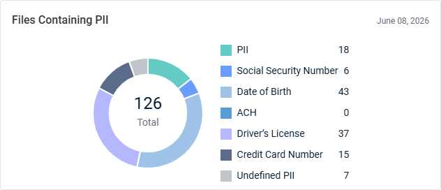
- Files Containing PII: This donut chart displays the total number of scanned files that contain personally identifiable information (PII), grouped by PII file type. This breakdown provides visibility into potential data privacy and compliance risks.
Spanning for Google Workspace: Google Workspace Backup Status Report
The Spanning for Google Workspace Executive Summary report provides visibility into the selected organization's cloud backup coverage and storage utilization during the selected date range. This data helps organizations identify protection gaps and ensure critical Google Workspace data remains secure and recoverable.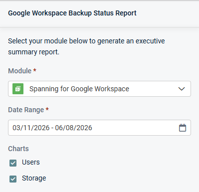
Charts
Select or clear checkboxes to add or remove the following widgets from the report, respectively:
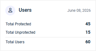
- Users: This widget summarizes Spanning Backup for Google Workspace user protection, including the number of users protected by a standard or archived license, unprotected users, and users across all mapped domains.
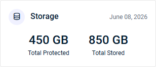
- Storage: This widget summarizes Spanning Backup for Google Workspace backup storage usage, including the amount of protected data and storage currently used to store backups.
Spanning for Microsoft 365: Microsoft 365 Backup Status Report
The Spanning for Microsoft 365 Executive Summary report provides visibility into the selected organization's backup coverage and data protection across Microsoft 365 services during the selected date range. This data helps organizations identify coverage gaps and ensure critical collaboration and business data remains recoverable.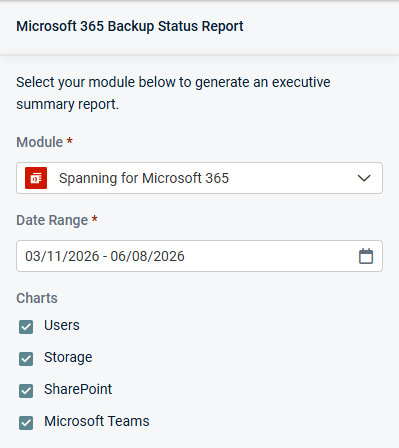
Charts
Select or clear checkboxes to add or remove the following widgets from the report, respectively:
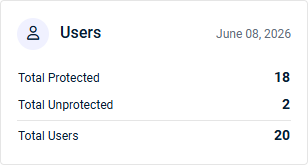
- Users: This widget summarizes Spanning Backup for Microsoft 365 user protection, including the number of users protected by a standard or archived license, unprotected users, and users across all mapped domains.
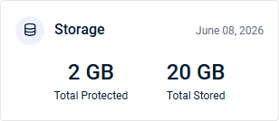
- Storage: This widget summarizes Spanning Backup for Microsoft 365 backup storage usage, including the amount of protected data and storage currently used to store backups.
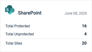
- SharePoint: This widget summarizes SharePoint site protection, including the number of protected (backed up) sites, unprotected sites, and sites across all mapped domains.
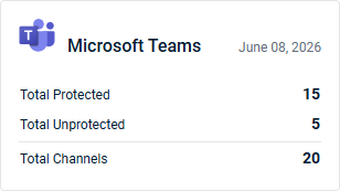
- Microsoft Teams: This widget summarizes Microsoft Teams channel protection, including the number of protected (backed up) channels, unprotected channels, and channels across all mapped domains.
Spanning for Salesforce: Salesforce Backup Status Report
The Spanning for Salesforce Executive Summary report provides a high-level view of the selected organization's Spanning Backup for Salesforce coverage during the selected date range. This data helps organizations verify backup adoption, identify potential coverage gaps, and ensure Salesforce data is safeguarded against loss.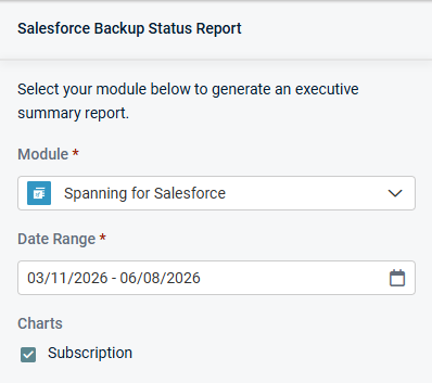
Charts
Keep the following checkbox selected to generate data in the report, which is displayed in a single widget:
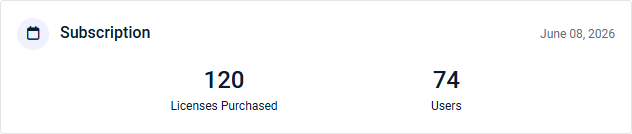
- Subscription: This widget displays the number of Spanning Backup for Salesforce licenses purchased and number of users.